My matplotlib toolbelt
I collected a number of code samples to plot graphs. All of them needed me to google a few things and dive into the matplotlib documentation. So it is usually a good starting point when you start a new analysis.
We will see three examples
- A cumulative distribution
- A count plot
- A frequency plot
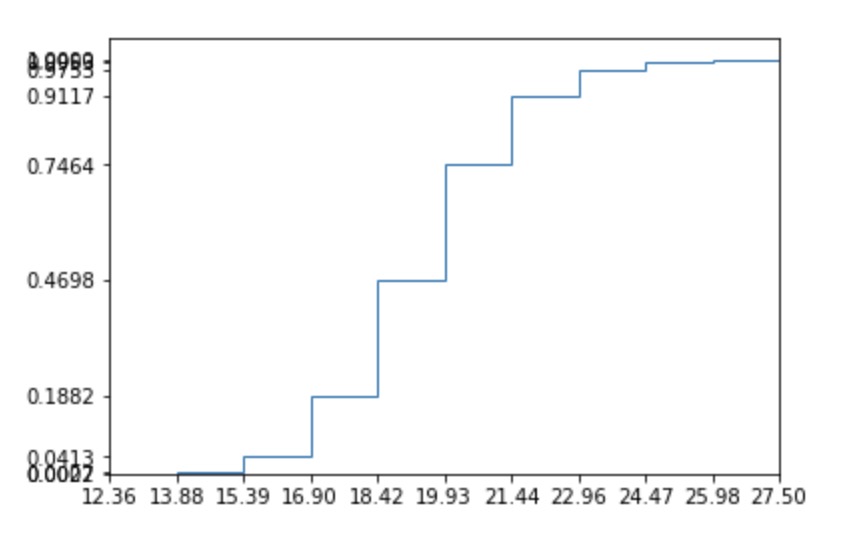
The cumulative distribution with hist
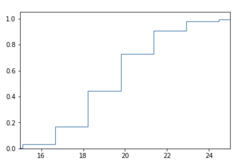
Easy enough with hist. However it is often
fig, ax = plt.subplots()
data = [np.random.lognormal(3, 0.1) for _ in range(10000)]

max_val = int(np.quantile(data, 0.99))
min_val = int(np.quantile(data, 0.01))

ax.hist(data, None, histtype='step', cumulative=True, density=True)

ax.set_xlim(min_val, max_val)
You can pimp a little bit your histogram to be able to read the probabilities. We can just change the last lines to have :
prob, buckets, _ = ax.hist(data, None, histtype='step', cumulative=True, density=True)

ax.set_xlim(min_val, max_val)
ax.set_xticks(buckets)
ax.set_yticks(prob)
Plot the most frequent terms from an array
Seaborn has an built-in function, but we can do a little bit better without much effort.
Note that it is relatively painful to change the plot options with the seaborn way.
import seaborn as sns
from collections import Counter
# Generate the data
choices = ["Poney", "Cat", "Dog", "Insect", "Bug", "Turtle", "Guinea pig",
"Pig", "Horse", "Lion", "Dragon", "Unicorn", "Elephant", "Others", "Kangoroo",
"Koala", "Dolphin", "Shark", "Rat", "Cockroach", "Beatle", "Gull", "Crow", "Eagle"]
prob = np.array([np.random.random() for _ in range(len(choices))])
prob /= sum(prob)
data = [np.random.choice(choices, p=prob) for _ in range(10000)]
# Seaborn Countplot
fig, ax = plt.subplots()
sns.countplot(data)
ax = plt.gca()
labels = [t.get_text() for t in ax.get_xticklabels()]
plt.xticks(range(len(choices)), labels, rotation="vertical", fontsize=10)
# Custom Countplot
def plot_count(data, title="", counted=False):
plt.style.use("seaborn")
if not counted:
counter = Counter(data)
else:
counter = data
fig, ax = plt.subplots()
size = 10
most_common = counter.most_common(20)
for i, l in enumerate(most_common):
rects1 = ax.bar(size * i, l[1], size / 1.5, label=str(l[0]))
labels = [most_common[i][0] for i in range(len(most_common))]
ticks = [size * i for i in range(len(most_common))]
ax.set_title(title)
plt.xticks(ticks, labels, rotation="vertical", fontsize=10)
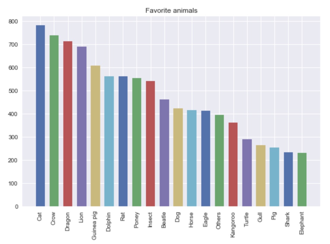
plot_count(data, "Favorite animals")
We get the following plots :
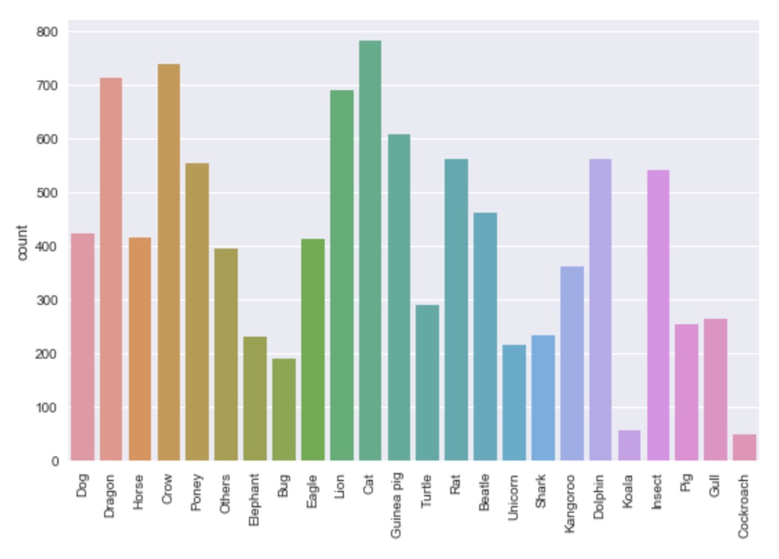 The Seaborn countplot
And out custom countplot
With our custom plot, we can easily see which animal is everyone’s favorite ! This will be even more useful with our next example.
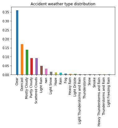
Plot relative frequencies
We will use data from the US accident dataset.
import pandas as pd
df = pd.read_csv("/Users/a.morvan/Downloads/US_Accidents_May19.csv")
data = df["Weather_Condition"].values
counter = Counter(data)
c_normalised = Counter({k: v / total_count
                        for k, v in counter.items()})
plot_count(c_normalised,
           "Accident weather type distribution",
           counted=True)
Now let’s have a look at the difference when the accident is on a roundabout.
# Collect roundabout accident only weather conditions
df_roundabout = df[df["Roundabout"] == True]
data = df_roundabout["Weather_Condition"].values

# Apply the count
roundabout_weather_counter = Counter(data)
total_roundabout = sum(roundabout_weather_counter.values())
# Difference : remove the global avergae on each category !!!
center_normalised_roundabout_weather_counter = \
    Counter({k: (v / total_roundabout) - c_normalised[k]
             for k, v in roundabout_weather_counter.items()})

plot_count(center_normalised_roundabout_weather_counter,
           "Accident weather type distribution on roundabouts",
           counted=True)
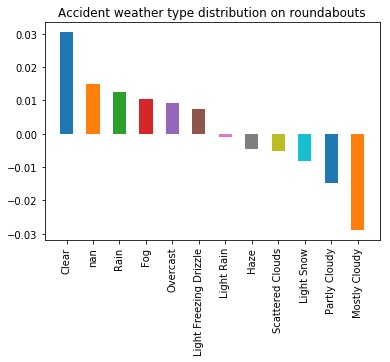
This is a great way to find variables that can be predictive of a particular event.